
Our goal: Get the average 12 through 50 year old to play with molecular cell biology and biochemistry.
Plan: Create a commercially successful game that requires the player to use proteins for their correct functions in order to win.
Problem: What is molecular cell biology and biochemistry? Most people do not even know the basics: What are the tools we use? What are our goals? War games have had say, 30 years to teach their audiences game by game how to pick up a gun, run and crouch, hide and aim… In our new molecular science game, we have just 2 minutes to interest the player, teach them some fun mechanics and make them feel competent and curious.
We are under the 2-minute clock, because we want to be commercially successful. Players can ditch us for the 10,000 other games at their fingertips. So we are following the advice of other successful, widely successful “mid-core” game developers: Get novice players playing as quickly as possible. See George Fan’s presentation on the topic of introducing game mechanics to new players, like his mom.
We have also made many game play decisions to get players playing, but this post is focused on our User Interface (UI). Below is a chronological description of our UI, results of play testing and our changes, and finally our current design plans. We started with our tower Defense styled game/UI in 2012, changed to a real time strategy game UI in 2013, and our current designs are a modern, VR-consistent, mid-core audience friendly, “Heads Up Display.” The current design is intended to feel responsive to the player, giving them a feeling of obtaining information on their demand.
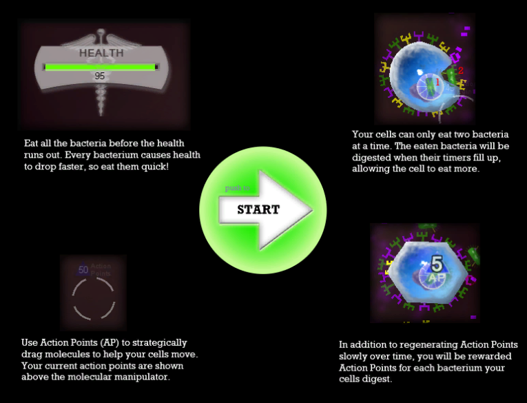
Our first UI. Top left: Splash screen started the level. Top right: Info cards showed up on the right side of the screen when items were clicked in game. Bottom: The game play was simple: all the player could do is move the floating cytokines (purple rectangles) closer to the cells.
What we learned:
Our high school aged game testers could handle the complexity of the science very well: they enjoyed the new game mechanics. Students said they wanted the game to look and feel real. They did not want to waste their time or money on a game that was not teaching them real biochemistry. They also wanted more levels. (We test our game in video game design and development related classes, not biology classes. In this way all of our discussions are related to the students’ real coursework.)
No one read the splash screen intro, but everyone paid attention to the score. Students would play around in the game, learn gameplay mechanics, and then shout out their high score. Other students would demand to know how they managed that score. The splash screen full of instructions was not an attractive source of information.
After playing, students could write down the names of the cells (Macrophage, Neutrophil). They knew the purple and green shapes on the cells were proteins. Students were indeed learning the level of detail we were presenting. These results are in alignment with our published data on Immune Attack, which showed us clearly that students remembered details about cells and molecules if they had to use those things in the game.
Students told us they wanted more levels to play. They wanted the game to be real biochemistry, not a waste of their time. We were going to need more complexity in order to build more levels. We needed a way to present more complex information to our players, while still making the information seem approachable.
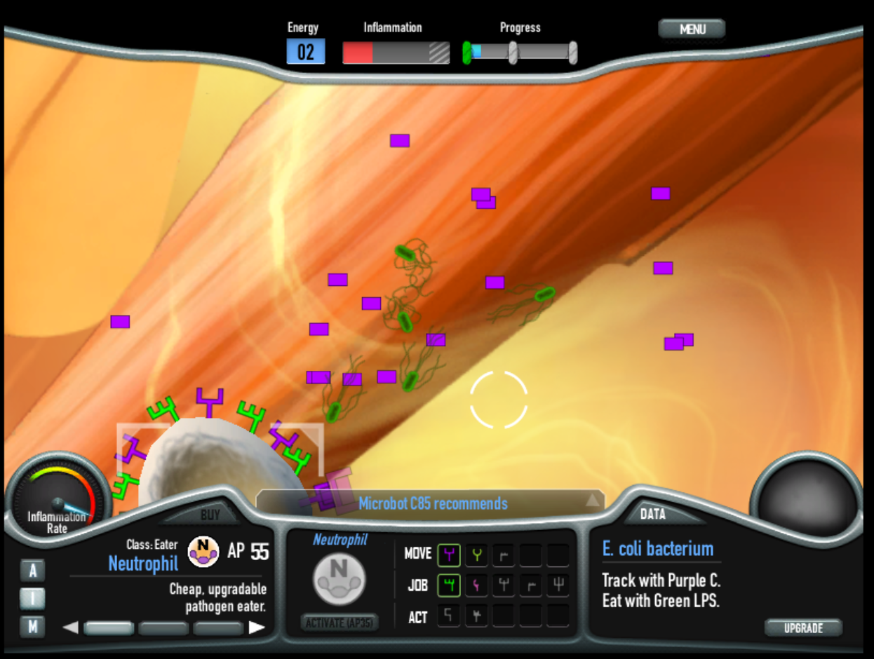
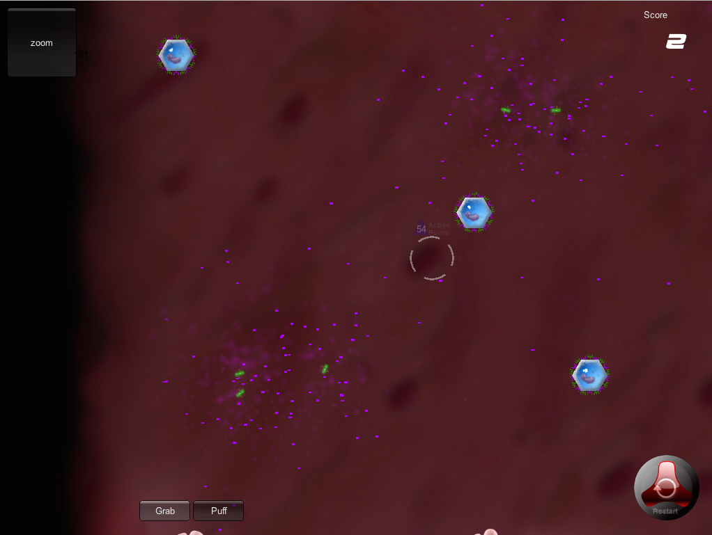
Our second UI. This is our currently available demo. In order to introduce complex details, I tried a standard, real time strategy game user interface: Along the bottom of the screen, we can Buy cells on the left, Modify them in the center and Get information about them on the right.
We designed this User Interface (UI) to be functionally similar to the UI strategy game players are used to: like Civilization and StarCraft. These Real Time Strategy games (RTS) have a lot of details to convey to the player, and so this interface seemed appropriate. When the player clicks on a cell or a molecule, the information panel on the bottom right side indicates the name and function.
We designed it to be simplistic and retro looking. Often, science fiction types of games include many lines and techy bits that give an appearance of being about science but only serve, I feel, to make things look complicated. I did not want things to be complicated. A 1950’s motorcycle is more approachable, I thought, than a techy UI.
Immune Defense game play was coming along and we began showing the game in public places, not just in high schools. Now we saw how people were reacting to the science. Our observations were that younger people are more likely to poke around in the game to see how it works, while older people were more likely to be intimidated by the fact that they did not already know the science or the game mechanic. Younger students were also more likely to quit playing if the mechanic was not fun for them and older people are more likely to persist and read instructions until the felt they had learned the science or the game.
This UI is inviting and makes players smile, rather then worry about the complexity of the science. However, this UI has drawbacks that hamper the game play. First, it is full of words, so players tend not to read any of them. Second, when the player clicks on an object and the new information is shown in the right side info window, players do not notice the change (RTS gamers do notice, but we are hoping for a mid-core audience). This makes it so that the player learns the gameplay but does not learn the names or the why. Third, when playing the high-speed hectic levels 5 and 6, the UI for changing the receptors on each cell is too far away from the cell to be done quickly.
The most common feedback we get from this version of Immune Defense is, “I like it, the game is fun, but I do not feel like I learned anything.” Which is kind of hilarious, since the player just learned how to add the correct protein receptor to a cell, follow a cytokine cloud, attach the cell to the bacteria and how endocytosis leads to dissolving the bacterium inside the cell. Weird. Scientists are fascinated by the level of detail we present while people walk away thinking they haven’t learned anything. We have indeed made the basic game play successfully engaging. Now what we need is a UI that makes people feel like they are learning.
This is a wireframes I drew to demonstrate what information a player should get when clicking on a bacterium. Similar information will be available when clicking on cells. The blue buttons will pause the game and open the Database. The window is designed to show player necessary info quickly, in text and graphics. Player can see at a glance which molecules this pathogen has and which the player already has the ability to interact with (yellow circles).
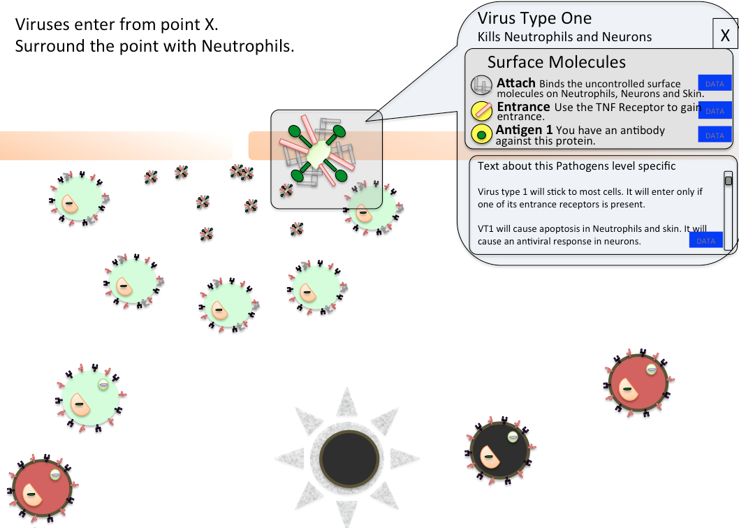
We designed our new UI to put the information next to the objects: Player clicks on an E. coli, and the information pops up next to the e coli: Player feels like they collected some data, they learned something, and that the game is really responding to them.
Our current plans are in development. They reflect several small changes in Immune Defense game mechanic and also reflect how people play with Immune Defense. First: The new GUI will be simpler looking, with almost no text or UI elements visible until the player engages. Second, when players do click on objects, the UI will provide feedback by popping up a window next to the object. Information appears on the screen where the player is already looking.
We plan to begin play testing our new UI in December. We are developing many more levels using the same game play elements we already have (There are many cool levels coming and I will describe them in future posts.)
Finally, some notes about our database:
We wanted a way to introduce more realistic images to the player. We wanted the realism not only to be more “educational” but also to be cooler and more attractive to our audience. (I cannot stress enough how related these two are. Reality and coolness, they actually are the same.) Of course, the way to introduce deeper facts to a player is not while they are playing, but when they are finished playing and hungering for more. Or, possibly, when they are stuck or taking a break from playing and want to get some game play tips. See the Almanac in Plants vs. Zombies and the Player Log in Metroid Prime for our inspirations.
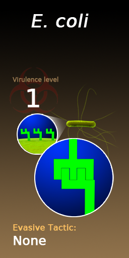
So we designed the Database: the Microbot’s onboard memory banks, that provide two things for the player: Game play tips and real life science details. The game play tips are attractive to players during the game. As seen in the images below, the three grey rectangles consistently provide three game tips, in chronological order, so that the last tip may not be useful until later levels. The tips are presented to the player during the game and they are not necessary to win the game: The Database is never forced on the player. The Database makes it easier to see all the data about an object, for example the E. coli bacteria. The surface molecules on the bacterium are important for game play, and are visible in the game, but here they are larger and the game is paused (top right of the page). The bottom image shows the real life version of the E. coli. We expect that seeing multiple versions of the same thing will demonstrate to the player that models do not show all the details and also make the player more familiar with wider range of diagrams and images pertaining to cell biology. We plan to assess this type of affect on players in our future research.
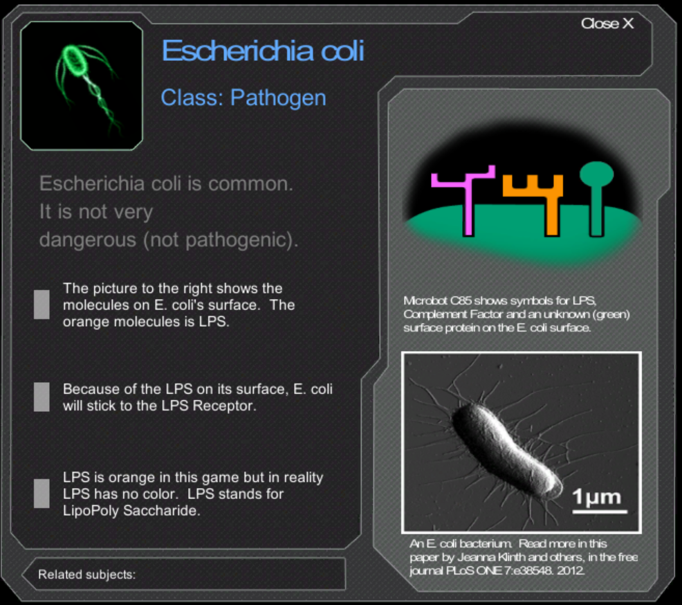
Three images of E. coli bacteria are resented on this Database page. The top left is how E. coli appears in the game, so the player knows what we are referring to quickly. The other two present the E. coli’s surface molecules (top right) and a real life electron micrograph of E. coli (bottom right).
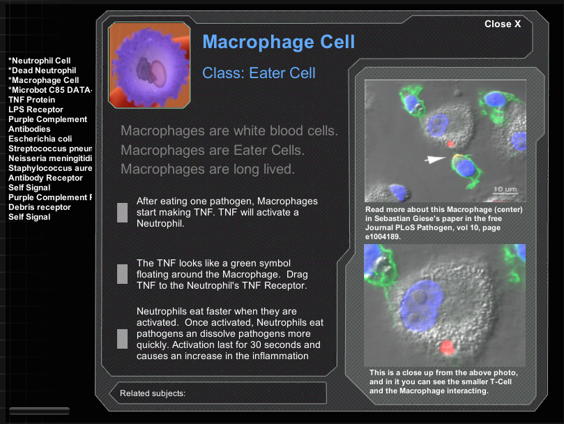
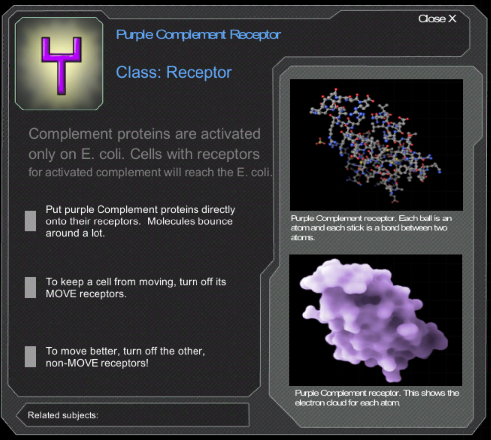
Here are the pages for the Macrophage and for the Purple Cytokine Receptor. The detail on these pages makes players feel like there are interesting facts behind the game, but they are never read by players during game play, at least not while we are observing players. We are convinced, and are creating evaluation tools, to access whether these images and tips help player feel more competent and whether the experience of interacting with these images make players more likely to read real science articles with similar images.
Thank you to everyone who supports us, tell your friends, and please keep in touch! ImmuneDefenseGame.com